Tuesday, December 7, 2010
Final Magazine Layout
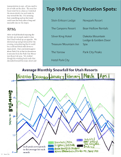
Here is the final layout for my magazine cover and spread. Hopefully everything works out when I go to print. The links were reestablished when I saved it as a pdf and indd but when I opened it up again the links were ? again. I had a great time working on this project and this allows me to see how feasible it is to construct a magazine layout and I hope to continue utilizing this skill.
Tuesday, November 30, 2010
?
I don't know why but I cannot figure out how to post the layout from indesign. I tried uploading it through the photo section and it says not valid. I will have to post this soon when I can figure out why it won't post the InDesign files.
Images and Layout for Magazine Spread
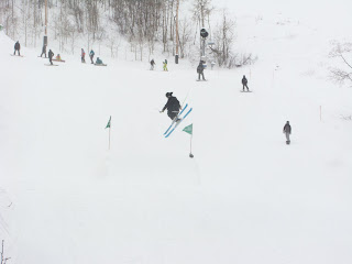
I have been working at these for the last two weeks and I wanted to post some of my progress. The skiing was the best best best part about this assignment, hands down.. but it usually is the best thing ever. :)
Tuesday, November 9, 2010
project 3 ideas for magazine layout
Today we had our meeting about what idea we would want to develop for our magazine spreads. I chose to go with the second option, which includes the cover and contents pages as well as two spreads (4 pages) on a specific article. I had ideas about vegan cooking, skiing/snowboarding, and organic sustainable apparel. I am highly interested in all of these ideas as they make up a lot of who I am and what I am spending my time doing. I eventually chose to do an article on Park City with an emphasis on the snow industry/ ski resorts. I initially was going to do the article in an interview format, but after thinking about it a little further, I think I am going to do a 'day in park city' format. This would include a morning to night documentation of a day in park city that would highlight the ski and lodging resorts, the atmosphere, the local shops, the night life and other aspects (if needed, the ones listed will most likely take up a two-spread article). I want to do an actual documentation of the article during the Thanksgiving break when I will be staying up in PC. I will be taking my own photographs and will be writing my own article for the assignment. Because of this, I will be focusing on the cover and contents pages for the next week or so because I won't have any images since I will be documenting and taking images during the week of November 21st. I have decided what my magazine will be and the title I came up with is Snow City Magazine or Snow Cities Magazine. The magazine discovers and documents different cities throughout the world that make snow and snow activities part of the main stream and which ultimately influences the lifestyle of the people who live there.
Final bookcover for project 2
Here is my final book cover. I had a few mishaps but overall I am very happy with the results. I asked my roommate and friends to look at it and see if they would buy or be interested in this book, and they said yes. So that was great to hear that it looked like a legitimate book cover. I misspelled Chicago once and when I copied the quote the front quotes did not copy over and the quote also put the period after the end quotes rather than before which is grammatically incorrect. I should have noticed but it just passed by my eyes. I am much happier with the spacing and coloring of the final compared to the rough final. Here it is!
Thursday, October 28, 2010
Rough Digital Sketches and rough final for project 2
I reshot the images in order to get a better angle and lighting and mood out of the photograph. I chose some imitation maple syrup for my river as it's color is similar to some types of booze and it was a brighter orange/golden color that gave the overall image some pop. I lined up the bottles in a path much like trees line the riparian zone of a riverbank. I then shot different angles and settled on one that had negative space up towards the top so I could have a distinct place to put my title. I also gathered up some bottles in the corner of the room and shot them for the back cover area to keep the theme consistent throughout the cover. I need to readjust the author and title and add in the publisher and barcode etc as well as watch my margins and change the font color to white or black rather than the green on green.
Thumbnail ideas for project 2
For my thumbnails I brought in a few (not so great) drawings of my ideas for the book cover. I wanted to do an HDR image of Logan Canyon for the book, but it wasn't addressing the underlying themes of the book as it was literally an image of a river running through a canyon. SO I decided to focus on the alcohol problem that occurred throughout the book. I wanted to set up some bottles and have liquid pouring out from one over the others sort of like simulating a waterfall. I can post some of those images shortly when I am on my own computer to do so. The light was focused too far to the right and so I needed to reshoot for a better angle and setup. Also, I took some photos of a reel in the hands of a guy (my roommates bf) but it didn't match up with the front cover idea. Because it seemed too separate of ideas, I just stuck with the alcohol bottles idea.
Wednesday, October 6, 2010
"thumbnail" for book cover
This is really just a summary of the book, A River Runs Through It. I have also included some image ideas, which I will expand on more throughout the weekend.
Jessica Madelyn Bengtson
Computers and Art
Book description and imagery
A River Runs Through It
This novella is set in the beautiful state of Montana around the 1930s and depicts the life and life lessons of a Presbyterian family, focusing on the two brothers. The father is a preacher and tries to build his family up around good values, hard work and lots and lots of fishing! The younger brother Paul is as wild and untamed as the nature in which he surrounds himself. His passion is fly-fishing, but his unruly behavior leads to drinking and gambling. His life is off-tilt and chaotic, but he finds his peace/sanctuary in the riverbanks. His older brother Norman has returned from college on the east coast and comes back in the summer to spend time with his brother fly fishing, trying to help Paul figure out his path and bring him back around. The novella filters metaphysical questions in through the experiences they encounter fly-fishing and life in general. My favorite idea from this book is we as human beings can surround, engulf and integrate ourselves in something so powerful: nature itself.
Some image ideas:
Integrating theme in landscape imagery
Logan Canyon Dams- people fishing
Two brothers fishing
Landscape panorama to wrap around the book cover
A church and a mountain: which would be a comparison of where people find their place of peace
A flowing river, slow shutter speed to create movement
Alcohol, gambling and fly-fishing
Final Pictograms
Tuesday, September 21, 2010
Progress on Illustrator Images
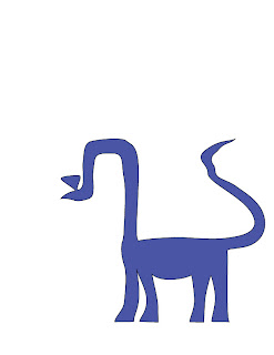
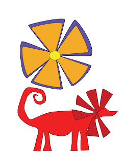
So I started my pictograms in the computer and the main tool, practically the only tool, I have been using is the pen tool. I have kinks and bends in places that need fixing as well as adjusting and moving my images around in order to improve my composition of the dinosaurs and flowers. I started out with the basic dinosaur shapes and added in the flowers. I think I might remove the stems and leaves from the image... actually I am going to for the final. They just seem to distract more than add to the overall quality. Here are some images so far..
Thursday, September 16, 2010
Rough Sketches for Project 1
From my rough sketches, I decided to continue developing the dinosaurs and the flowers. I am going to attempt to do a combination of some sorts with each dinosaur image matching up with each flower image. I want to focus primarily on emphasizing the shapes, exploring different color schemes and finalizing my compositions. It will be interesting to see how I do in creating an illustration versus my hand-drawn images, hopefully it turns out great!
Thursday, September 9, 2010
For my collage I threw together some images, most that describe me and my lifestyle and I decided to go with a more cardboard cut look. I spent most of my time working on the details of the skier and the guitarist. I had trouble with going back and forth in order to see the details from the base image, but hopefully this will transition to smooth and pain-free. I enjoyed this project, it takes a lot of time to zoom in and put details but the difference is amazing. The skier for example, I started with just a plain yellow shape and after I worked the shadows and creases it made the image pop out rather than just sit flat on the screen.
Thumbnails for project 1
So for my thumbnails I had to focus on three interrelated images that would express an idea or word or thought on a universal level. The ones I would like to continue working on are the dinosaurs, the topography, the flowering bud, and the grapes and wine images.
I chose the dinosaurs for their shapes and lines that would make up their design, and I find them interesting and mysterious so I could really take my design to my own interpretation of them.
The topography would be cool to see what abstract yet readable images I can produce that describe different types of ecosystems, and adding on to that, the rose/bud idea stemmed from my interest in how energy and cycles occur in nature and in our own lives.
The wine and grapes would be great, I would like to again see them for their shapes and working on a more monochromatic color scheme.
Subscribe to:
Posts (Atom)


